
| 일 | 월 | 화 | 수 | 목 | 금 | 토 |
|---|---|---|---|---|---|---|
| 1 | ||||||
| 2 | 3 | 4 | 5 | 6 | 7 | 8 |
| 9 | 10 | 11 | 12 | 13 | 14 | 15 |
| 16 | 17 | 18 | 19 | 20 | 21 | 22 |
| 23 | 24 | 25 | 26 | 27 | 28 | 29 |
| 30 |
- ViT
- programmers
- 논문구현
- 코딩테스트
- 머신러닝
- pytorch
- Computer Vision
- Semantic Segmentation
- Paper Review
- 파이토치
- 알고리즘
- 논문 리뷰
- opencv
- object detection
- Self-supervised
- 파이썬
- 코드구현
- 딥러닝
- 논문리뷰
- Ai
- 프로그래머스
- Segmentation
- cnn
- 옵티마이저
- Convolution
- 논문
- transformer
- 인공지능
- Python
- optimizer
- Today
- Total
Attention please
데이터 시각화(legend) - matplotlib 본문
legend (범례)
plot, scatter, hist, bar 함수에는 legend를 추가할 수 있습니다.
2가지 단계로 추가할 수 있는데
1. 그림을 그리는 함수에 label 파라미터를 추가
2. ax.legend()를 호출
로 legend를 추가합니다.
또한 legend함수의 title파라미터를 사용하여
범례의 제목을 입력할 수 있습니다.
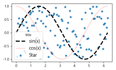
fig = plt.figure(figsize = (5,3), dpi = 100)
ax = fig.subplots()
X = np.linspace(0, 2*np.pi, 100)
Y1 = np.sin(X)
Y2 = np.cos(X)
# plot, scatter 함수의 label 파라미터 추가
_=ax.plot(X, Y1, c='k', lw=3, ls='--', label='sin(x)')
_=ax.plot(X, Y2, c='r', lw=1, ls=':', label='cos(x)')
_=ax.scatter(X, np.random.uniform(-1,1,size=100), marker='*', label = 'Star')
# legend 함수 호출
_=ax.legend(fontsize = 13, title = 'title')
하지만 라벨의 스타일을 설정하기 위해서는
시각화 함수마다 리턴 객체의 구성이 다르기 때문에,
legend에 사용할 정보가 있는 주소에 접근해서 정보를 가져와야 합니다.
주소에 접근을 위해서 legend함수의 handles와 labels 파라미터를 사용합니다.
handles에는 함수의 리턴 객체를,
labels에는 원하는 legend text를 넣습니다.
plot & scatter
fig = plt.figure(figsize = (10,6), dpi = 100)
ax = fig.subplots()
X = np.linspace(0, 2*np.pi, 100)
Y = np.sin(X)
l1 = ax.plot(X, Y, c = 'k', lw=3, ls='--')
l1
l1[0]
_=ax.legend(handles = (l1[0],), labels=('sin(x)',))
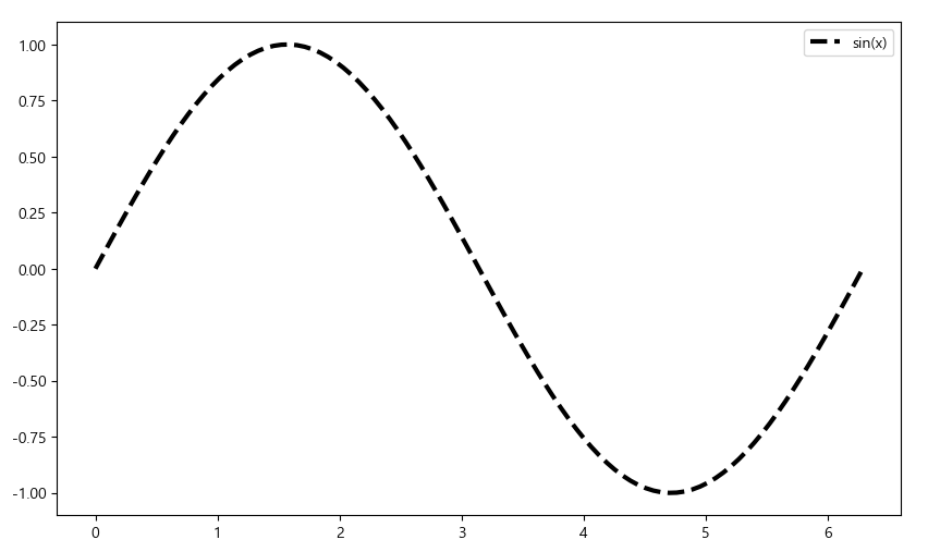
이때 legend함수의 handles, labels파라미터 값은 튜플형태로 넣어야 하며,
element가 하나일 때 쉼표를 추가하여야 합니다.
또한 plot함수의 경우 변수를 그대로 실행시켜보면 list안에 주소가 들어가 있습니다.
즉, <변수[0]> 슬라이싱을 통해 주소값을 수정하여 handles파라미터에 입력하여야 합니다.
(시각화 함수마다 주소가 출력되는 방식이 다르기에 항상 슬라이싱을 하는 것이 아님)
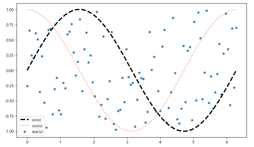
scatter함수의 경우 변수 그 자체에 주소가 입력되어 있습니다.
즉, plot함수와 다르게 슬라이싱을 추가로 해주지 않습니다.
fig = plt.figure(figsize = (10,6), dpi = 100)
ax = fig.subplots()
X = np.linspace(0, 2*np.pi, 100)
Y1 = np.sin(X)
Y2 = np.cos(X)
plot1 = ax.plot(X, Y1, c='k', lw=3, ls='--')
plot2 = ax.plot(X, Y2, c='r', lw=1, ls=':')
scat1 = ax.scatter(X, np.random.uniform(-1,1,100), marker = '*')
_=ax.legend(handles=(plot1[0], plot2[0], scat1), labels = ('sin(x)', 'cos(x)', 'star(x)'))
hist & bar
시각화 함수 중 hist함수는 legend에 입력할 주소를 가져올 때,
<변수[2]>로 슬라이싱을 해서 가져와야 하며,
bar함수의 경우 scatter함수와 같이 변수 그 자체를 사용하면 됩니다.
fig = plt.figure(figsize = (5,2), dpi = 100)
ax = fig.subplots()

hist1 = ax.hist(np.random.normal(0,1,100), bins = 20, edgecolor = 'k', color = 'r')
hist2 = ax.hist(np.random.normal(2,1,100), bins = 20, edgecolor = 'k', color = 'b')
bar3 = ax.bar([3,4,5], [1,2,3], color = 'g')
bar4 = ax.bar([6,7,8], [3,2,1], color = 'c')

_=ax.legend(handles=(hist1[2], hist2[2], bar3, bar4), labels=(list('abcd')))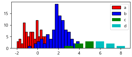
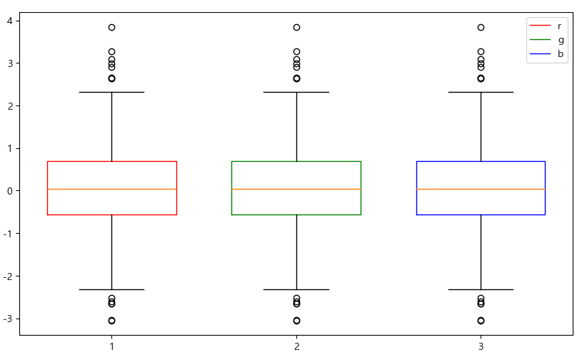
boxplot
시각화 함수 중 boxplot함수의 경우
<변수['boxes'][0]>로 슬라이싱을 하여 주소를 입력해야 합니다.
fig = plt.figure(figsize = (10,6), dpi = 100)
ax = fig.subplots()
d1 = np.random.normal(0,1,1000)
d2 = np.random.normal(1,1,1000)
d3 = np.random.normal(2,1,1000)
bp1 = ax.boxplot(d1, positions = [1], widths = 0.7, boxprops = {'color':'r'})
bp2 = ax.boxplot(d1, positions = [2], widths = 0.7, boxprops = {'color':'g'})
bp3 = ax.boxplot(d1, positions = [3], widths = 0.7, boxprops = {'color':'b'})
ax.legend(handles = (bp1['boxes'][0], bp2['boxes'][0], bp3['boxes'][0]), labels = list('rgb'))
legend 위치 선정
legend 함수의 loc파라미터를 사용하여 legend의 위치를 설정할 수 있으며,
ncol파라미터로 legend의 column 개수를 설정할 수 있습니다.
fig = plt.figure(figsize = (5,3), dpi = 100)
ax = fig.subplots()

X = np.linspace(0, 2*np.pi, 100)
Y1 = np.sin(X)
Y2 = np.cos(X)

_=ax.plot(X, Y1, c='k', lw=3, ls='--', label='sin(x)')
_=ax.plot(X, Y2, c='r', lw=1, ls=':', label='cos(x)')
_=ax.legend(title='function name', loc='upper center', ncol=2, fontsize = 13, title_fontsize = 15)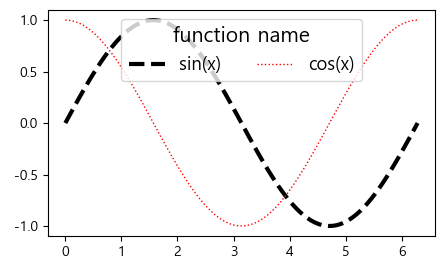
bbox_to_anchor
bbox_to_anchor을 사용하게 되면 loc파라미터는 text 함수처럼 작동하게 됩니다.
즉, bbox_to_anchor = (0.5, 1.0) 으로 되어있다면,
해당 좌표를 기준으로 하며 loc 값으로 해당 위치에서 legend의 위치를 설정시켜줍니다.
fig = plt.figure(figsize = (10,6), dpi = 100)
axs = fig.subplots(2,2).flatten()

X = np.linspace(0, 2*np.pi, 100)
Y1 = np.sin(X)

_=axs[0].plot(X, Y1, c='k', lw=3, ls='--', label='sin(x)')
_=axs[0].legend(title = 'func name', loc = 'lower center', ncol = 2, fontsize=12,
               title_fontsize = 12, bbox_to_anchor=(1.0, 1.0))

_=axs[1].plot(X, Y1, c='k', lw=3, ls='--', label='sin(x)')
_=axs[1].legend(title='func name', loc='upper left', ncol=2, fontsize=12,
               title_fontsize=12, bbox_to_anchor = (1.0,1.0))

_=axs[2].plot(X, Y1, c='k', lw=3, ls='--', label='sin(x)')
_=axs[2].legend(title='func name', loc='upper left', ncol=2, fontsize=12,
               title_fontsize=12)

_=axs[3].plot(X, Y1, c='k', lw=3, ls='--', label='sin(x)')
_=axs[3].legend(title='func name', loc='upper right', ncol=2, fontsize=12,
               title_fontsize=12)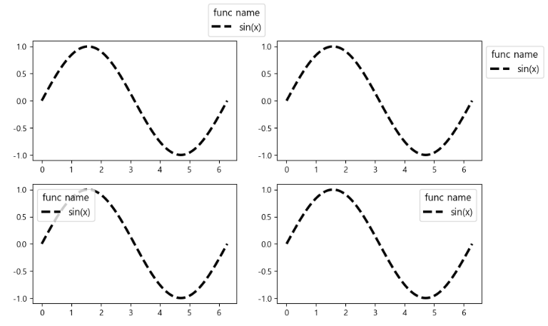
'데이터 시각화 > matplotlib' 카테고리의 다른 글
| 데이터 시각화(tick label & tick param & text) - matplotlib (0) | 2022.11.18 |
|---|---|
| 데이터 시각화(title & lim & tick) - matplotlib (0) | 2022.11.17 |
| 데이터 분석;boxplot으로 중요한 피처 구분하기 - matplotlib (0) | 2022.10.12 |
| Color와 Style 사용하기 - matplotlib (0) | 2022.10.08 |
| 상자그림 그리기(boxplot) - matplotlib (0) | 2022.10.08 |


